
ESMA
- Nov 30, 2016
- 1 min read


What is a ligature logo?
Ligature means to tie. Letters that are tied make a compact signature perfect for companies that are known mainly by their initials.
How would describe the corporate identity of ESMA in 5 words?
Innovative
Classic
Hip
Diverse
Edgy
Which logo out of the two do you feel is the strongest and why?
My first logo is my strongest because I feel it identifies more with Epic Records. It is clean cut, with a classic font and has a simple design, which simple designs are trendy now.
If you had no requirements or restrictions how would your logo look different?
My logo would probably have graphics in it because I feel graphics can make a logo stronger and convey the point of the company easier.
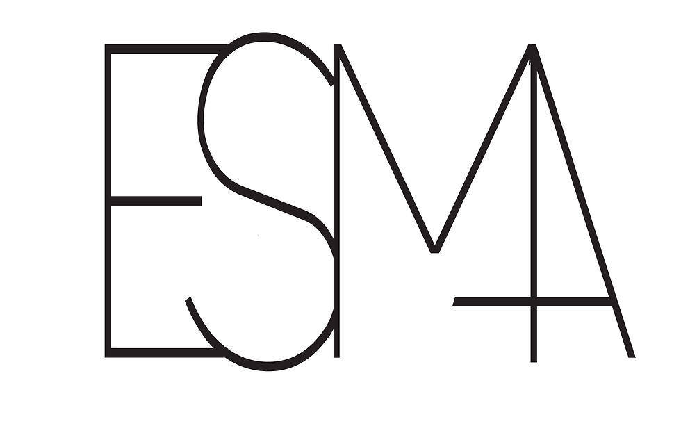
Explain which ligature techniques you have demonstrated on each logo:
In my first ligature I removed s stroke of the “A” and attached it to the “M” and in my second logo I removed one of the legs on the “M” and made some of the letters transparent.


Comments